Basalt
Website design for a gym.
- Type
- Design preview
- Industry
- Gyms and fitness
- Features
- Text that fills as you scroll, Train or Recover split, class timetable, promo pop-up
- Live site
- Visit the site ↗
The brief
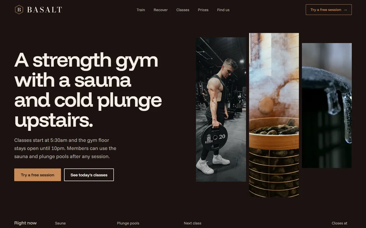
People choose a gym by what's inside and whether a class fits their day. This design preview shows both straight away and makes the first session easy to book.
What we built
Text that fills as you scroll
A large line about the club turns from grey to white, word by word, as visitors scroll, while the photos beside it move at different speeds.
Train or recover
Moving the cursor to the left opens the training side with its classes, and moving it right opens the sauna and plunge pools. On a phone it becomes two tabs.
A timetable for every day
Day tabs list each class with its coach and how many spots are left. Tapping a class fills in the free session form for that day.
What's on right now
A bar under the opening screen shows the sauna and plunge temperatures, the next class and when the club closes.
A promotional pop-up
A square pop-up offers 10% off the first three months for joining online. On this preview it doesn't collect anything.
The design
A warm brown page with copper buttons, a fine serif logo with a hexagon crest (the shape basalt forms in nature), and a clean sans-serif for everything else.
Built for phones
On a phone the training and recovery sides become tabs, each class fits on one row, and the pop-up fills the width. Visitors who turn off motion see the text already filled in.
Next projectDon & John Exterior Cleaning →